What is fluid web design?

Translated from the original Spanish article.
These days every web designer, and half the planet, knows what responsive design is. But some other terms that are back in fashion, and whose meaning has clearly evolved, can still be confusing. Fluid design is one of them.
What is fluid web design?
These days every web designer, and half the planet, knows what responsive design is. But some other terms that are back in fashion, and whose meaning has clearly evolved, can still be confusing. One of them is fluid design.
There is no real consensus on where responsive, fluid and adaptive each begin and end. So we'll stick to the distinctions that are most useful in practice, and focus on fluid design, which gives you more ways to fine-tune how the interface behaves for a better user experience and better accessibility.
Starting at the beginning: in my view, it isn't entirely accurate to treat fluid web design and responsive design as separate things. What's really happening is that "fluid" is being used to highlight responsive best practice when it comes to designing a website's elements and layout relative to the size of the screen it's viewed on.
To be specific, fluid design is a design system that adapts a website not only in its layout, but also in its sizes, heights and spacing, relative to the resolution of the screen it's displayed on.
This means elements render one way or another depending on the device we use. If we're on a phone that's 420px wide, the site will look different from how it looks on a 360px-wide screen. The same goes for tablets, desktop PCs, a TV, a Game Boy or the screen on a smart fridge.
Beyond layout, relative units are recommended practice especially for interactive or media elements, whether images, videos or animations. But they can also be applied to other parts of a website, such as typography, particularly H1 or H2 headings. We'll get to that.
The key point is that in fluid design, as I said, instead of fixed sizes in pixels or other units, we use relative units such as Viewport Width (VW) / Viewport Height (VH) / EM / REM and percentages (%).
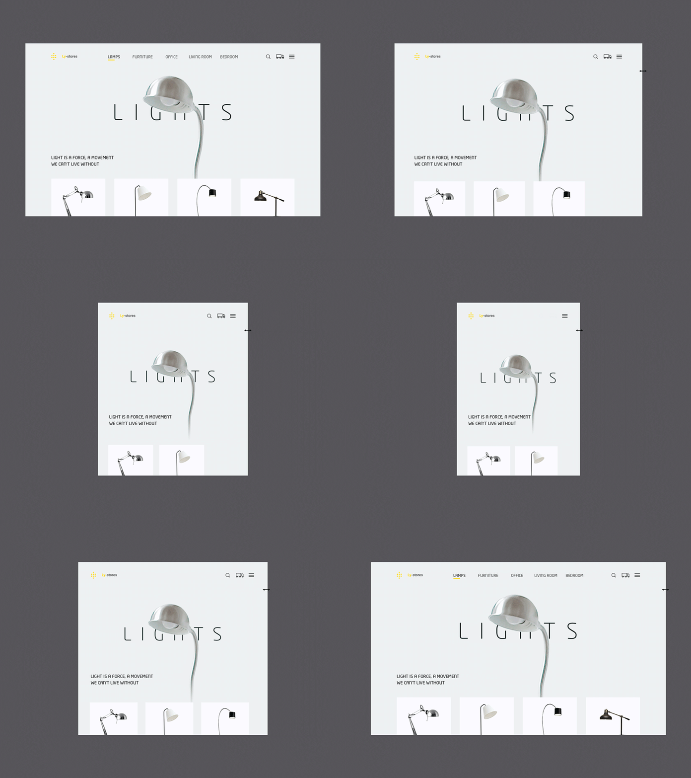
The main goal of this system is to keep the same look and intent the prototype was designed with across every device, even for small differences in size. These prototypes are usually designed with a different layout for each screen width, depending on the breakpoint, and with the user and their experience at the centre. That's why it's worth mentioning that fluid, or relative, design also helps with the accessibility and usability of a website.
That said, the first thing to bear in mind is that relative sizes aren't a perfect solution. They need to be complemented with fixed sizes and with maximums and minimums wherever that gives a better result, because elements tied to screen width can end up far too large or too small depending on the device.
Further on we'll look at some practical guidelines for how we approach fluid design ourselves, although it's fair to say that practice is what will really make you master the technique.
A bit of context
Ever since the iPhone came out in 2007 (yes, almost 20 years ago now), everything changed. Smartphone users suddenly had access to a quality web browsing experience that simply hadn't existed before.
Today we have an enormous variety of screen sizes, as many as 15 for a single device once you factor in zoom levels, browser size settings or landscape mode on phones. The thing is, even back then Ethan Marcotte, the web designer who coined the term "responsive", was saying that people browsing on mobile behave differently, with different intentions and different needs, from those on desktop. Among other things, they don't want to read as much text and their navigation paths are more direct.
Still, it makes me wonder how much of that behaviour is learned: users who got used to a poor mobile experience. Although it's true that the context in which you use a phone, compared with a desktop, also plays a part.
Certainly, anyone who was online in those days will agree that websites were neither designed nor ready for that flood of devices and screens.
In any case, as I was saying, Ethan Marcotte was the first to talk about "responsive web design", in 2010. He did so in this article, published on alistapart.com.
But accessibility and the multi-device experience had been under discussion for some time, as had making designs adaptable. A year earlier, in 2009, Marcotte himself published an article called Fluid Grids. In it he already explains the relationship to the browser's 16px and uses the relative unit EM for headings and text, though with some differences, at least compared with the practices we currently use at the agency. We use EM relative to the body font size, and REM relative to the browser's settings.
Either way, the whole point of this movement of good practice and accessibility standards is to build a web ecosystem that is accessible to everyone, with the best possible experience regardless of context or device. And the big brands that bet on their online channel started applying it.
Today, a website with enough traffic can record more than 1,000 different user screen resolutions. And our products have to be ready for all of them, or at least the vast majority.
At this point I'll ask the reader's indulgence, because I'm going to use this breather to slip in a little SEO detail with the anchor text responsive design.
Differences between traditional Responsive, Adaptive and Fluid Responsive (in practice)
Traditional responsive:
By traditional responsive we mean the most common responsive design practices, where elements usually have a fixed size but are rearranged vertically depending on the screen width, or Viewport Width. This is what we know as stacking elements inside a container or wrapper, where the container typically has relative widths in percentages or VW, and inside it the elements arrange themselves according to the space available.

As you can see in the animation, the elements rearrange themselves with the screen width, but they have absolute sizes that don't change.
To apply this adaptation, the most common approach is to use media queries for the different screen sizes, so the site's layout is adjusted to each width when the differences become too large.

The weaknesses of this system show up mainly between breakpoints. If we have a layout defined for screens between 1440px and 1650px, within that range the elements won't adjust dynamically to the width, as long as absolute sizes are being used.
This way of handling responsive design is useful and effective when the design doesn't need a particularly precise finish, or when you're working with a very modular, contained type of design.
Adaptive:
What is usually called adaptive design doesn't conflict with responsive. To put it simply, the difference is that adaptive has different files for each device: a specific layout is created for each screen on which we want the application to display properly. Using the browser's user agent, we can decide which layout to load for that particular user and device.
It has its advantages. For example, you can iterate on a given layout independently and more comfortably, without touching the rest of the design. And on large sites, it's good that users only load the layout for their device, rather than a single stylesheet that can become very large.
Bear in mind that sometimes, when we use a single responsive layout, there are elements we hide on certain devices and, conversely, others that we show. This is especially noticeable in navigation menus. With adaptive design we'd save users from loading elements that don't apply to them.
However, it's also more work.
In my view, this technique makes sense for large ecommerce sites like Amazon or BestBuy. It's also well suited to app development.
If you want to dig deeper, I recommend following the Flutter community. Flutter is an SDK developed by Google, with its own YouTube channel and plenty of content on the subject.
Fluid Responsive:
Fluid design, then, is a form of responsive design that avoids fixed sizes unless they're necessary and makes its measurements relative to screen width. It also includes maximum and minimum sizes, so that a large element such as a heading doesn't get out of hand, and so we don't end up with text smaller than 16px on small devices.
Other than that, go with the flow.
We'll keep breakpoints and modular stacking of elements whenever it makes sense and, in short, make whatever adjustments each situation calls for.
All in all, fluid design gives us a better user experience between breakpoints and a finish that stays very faithful to the design intent.
So, which system should you use?
Well, as you'd expect, whichever suits each case best. That said, I recommend applying fluid responsive as the general logic for building websites.
It's good, and important, to understand that when we design on our nice screens we get a biased, partial view of the result, since most visitors to the site will probably be using different resolutions.
General responsive design best practices
As we said, every case is different and these practices aren't rigid or absolute, but they are undoubtedly healthy to keep in mind.

- Design with a progressive enhancement or mobile first mindset: start from the screen layouts that demand the most simplicity and build up the design towards more complex layouts.
- Know and keep in mind the main screen resolutions, at least the widths.
- Spot resolutions that are gaining ground, so your design is ahead of the coming years.
- Review the site's historical metrics (if you have them). If you don't, use general data on browsing share by device and browser.
- Consider how users interact on each screen: on mobile we use our fingers, much as on a tablet, as opposed to the precision of a mouse on desktop. This has several implications for small screens:
- 01Buttons, like links, should be large and easy to reach with the thumb.
- 02Ideally, sliders should be swipeable, i.e. scrollable horizontally with the thumb.
- 03Search becomes more important and must be easy to access.
- 04Navigation should be comfortable and simplified.
- 05Focus the content on what matters most and remove the most superfluous elements.
- 06Study and understand your users' browsing intent and context on mobile.
- Pay attention to what happens between breakpoints: you may have blind spots where elements overlap or the layout doesn't display properly.
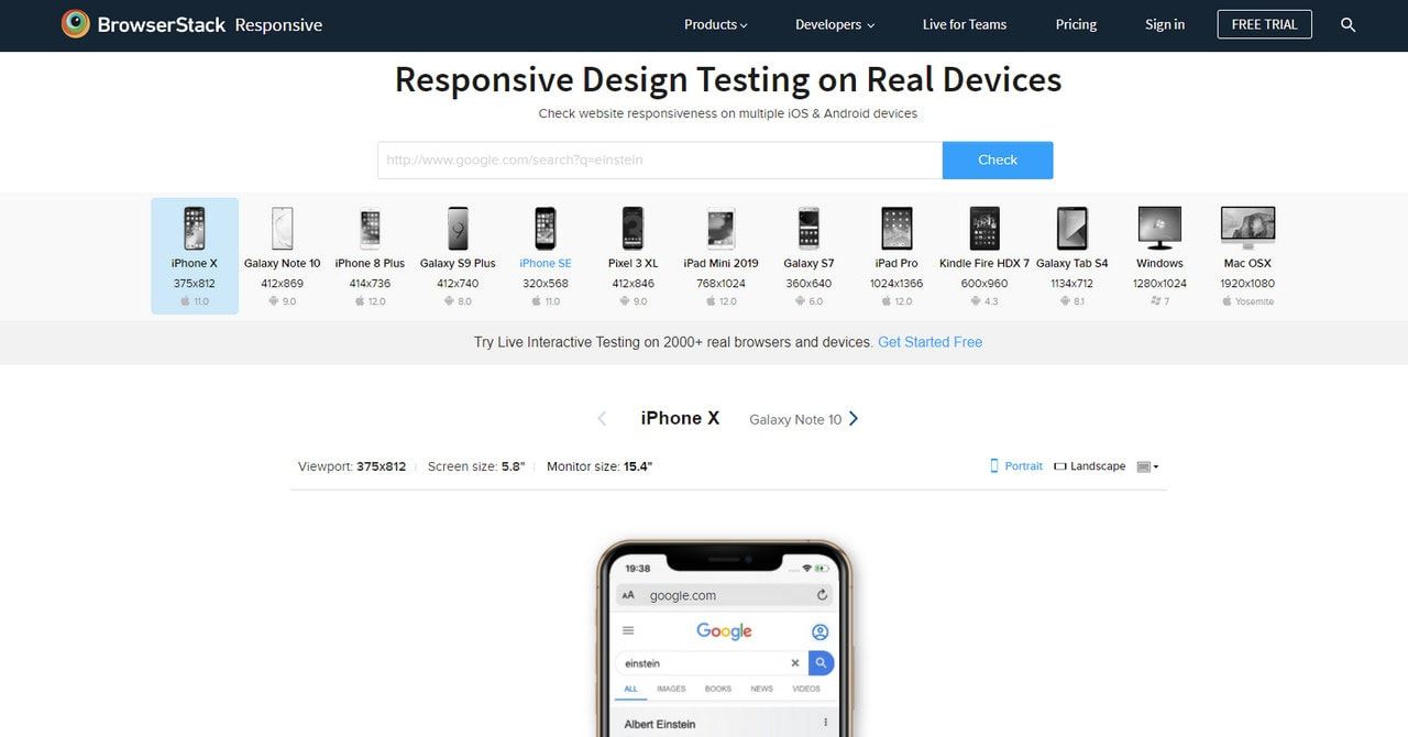
- Test. Not just with dev tools, but with real users and real devices.
How to apply fluid design in Webflow: Finsweet vs Wizardry
Right now, for no-code with Webflow, there are two trending approaches, and we use them at kingseo. One is Wizardry, by Timothy Ricks. The other is Finsweet's system. Both were very much in active development in 2022. 2026 update: since June 2025, Webflow natively supports CSS functions such as clamp(), calc(), min() and max() in its variables, so much of this fluid sizing with maximums and minimums can now be handled without external calculations or custom code. Finsweet's Client-First system is now on version 3, rebuilt around Webflow Variables.
Although we use the Wizardry logic, both have their pros and cons. Let's look at the differences:
Wizardry
With Wizardry, we use the viewport width (vw) as the reference for the body, the parent par excellence, and every class inherits that reference for its proportional sizes in EM.
Let me explain: an *EM* is a value proportional to the font size of the parent container. In other words, if we give <body> a font size of 1vw, the EM value of any element on the page will be relative to it (unless another parent says otherwise).
So a font size of 3EM will equal 3VW, as long as its parent container is set to 1vw.
But this only guarantees the relationship between size and the current screen width. What we also want is for it to stay proportional to the size relationships in our prototype.
For example:
If our prototype has a 16px font size at a width of 1440px, we want the font size on a 1650px screen to be X, where X is to 1650 what 16 is to 1440. Yes, a rule of three.
In this example, the <body> font size will be 1.111111111112vw. And we'd simply divide our Figma font sizes by 16 to use them as EM in Webflow.
If we have a heading with a 90px font size in our 1440 Figma, we can replicate it in Webflow by dividing by 16: (90/16) EM, where EM equals the body font size (1.111111111112vw).
That makes it exactly proportional, whatever the screen size of the device it's viewed on.
But we'll also need maximums and minimums, for containers, for typography and for any other element we don't want to keep growing or shrinking unchecked.
In this example, we define in CSS a maximum font size and a maximum container width for resolutions above 1440px.
<style> body {font-size: 1.1111111111111112vw;}
/ Maximum font size / @media screen and (min-width:1440px) { body {font-size: 16px;} }
/ Maximum container width / .container {max-width: 1440px;} </style>
If you need to see it more clearly, I recommend these videos by Timothy Ricks:
And a more complete one on the new version, Wizardry 2.0:
Finsweet
Finsweet, on the other hand, uses REM as its relative unit, which depends on the user's browser settings.
If we use a large text setting on our computer or phone, typically 18px or 20px instead of 16px, REM will be relative to that size.
In terms of accessibility, REM adapts the size of our layout to the user's needs. And that's a very good thing.
However, we then also need to tie it to the screen width with a VW calculation.
Here's a Finsweet video where they explain it in detail:
The main advantage of Finsweet's system is its commitment to accessibility. It's also 100% compatible with the standard of its *Client-First class system*, which is becoming popular in the Webflow community and is also used by the Relume library.
Conclusion: here's to the "One Web"
One Web means a website as a single, versatile product, usable by every kind of user on any device. User experience should be our goal, because our products' objectives depend on user satisfaction.
Removing friction from browsing and making it easier for all those brands, media, people and organisations of every kind to connect with the audiences who appreciate and consume them seems like a worthy mission.
For my part, dear reader, I hope I've been able to offer some useful information on the questions you had. Whatever system you use, I believe that with a user-centred design philosophy your products will be more used and more valued by everyone.
By the way, if you run or work at a design studio in Madrid, or anywhere else, we can build your prototypes. Just get in touch and propose a collaboration.
All the best, and happy designing.
References
https://ethanmarcotte.com/books/responsive-design-patterns-and-principles/
https://ethanmarcotte.com/books/responsive-web-design/
https://developer.apple.com/design/human-interface-guidelines/
https://designmodo.com/responsive-design-examples/
ADAPTIVE WEB DESIGN - Crafting Rich Experiences with Progressive Enhancement by Aaron Gustafson
https://www.youtube.com/watch?v=Bo_uruYwhdQ
https://alistapart.com/article/whereourstandardswentwrong/
https://alistapart.com/article/fluidgrids/